

Scepter Marketing
Strategy
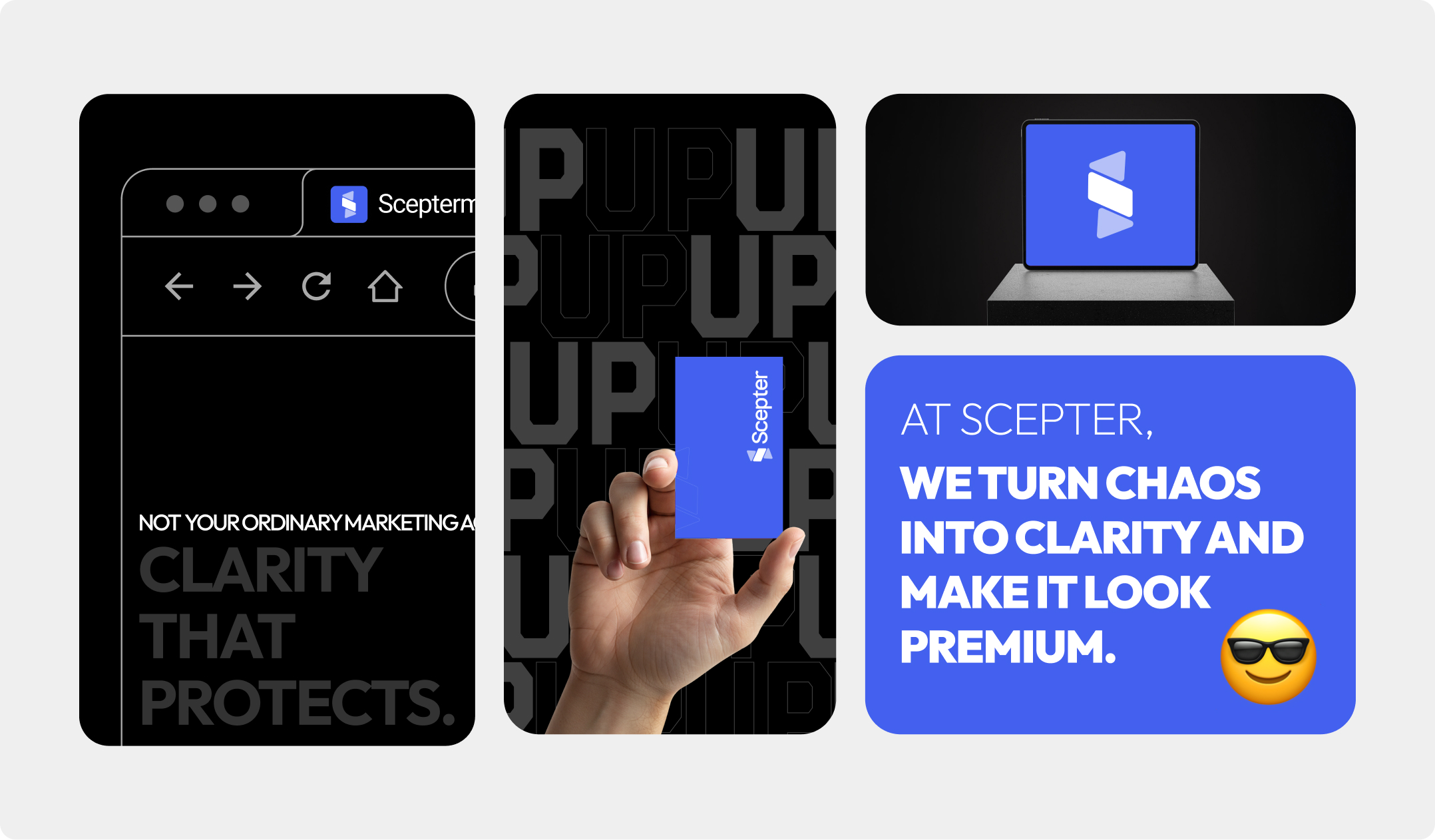
Scepter Marketing's brand strategy is built around clarity, control, and command reflecting a company that doesn't just participate in the market but leads it. The structured logo system ensures adaptability across every touchpoint, from bold, full-scale brand presence to compact digital identifiers, maintaining consistency without compromising impact.
Visually and tonally, the identity leans into precision and authority, using sharp, deliberate forms to signal expertise, confidence, and a no-nonsense approach to results. This creates a sense of premium positioning where every interaction feels intentional and elevated while the controlled distance in tone reinforces exclusivity and trust.
Colors
Base Colors
Dark blue symbolizes trust, integrity, and professionalism. For Scepter, the palette supports credibility and stability while keeping the brand sharp, technical, and premium.
Primary
Light
Lighter
Shades of Grey
The monochromatic palette gives Scepter visual cohesion, hierarchy, and depth across digital and print applications.
Logo Concept
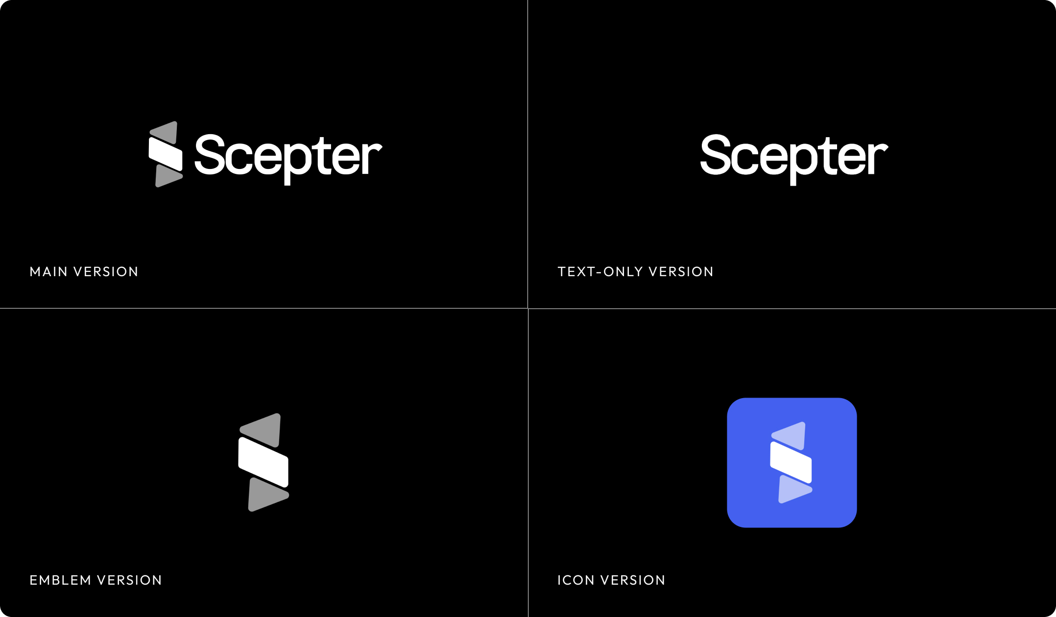
The logo is designed in four variations for different types of media.
Main Version: The main version of the logo contains the full name and symbol. It can be used on printed and digital products, as well as on social networks.
Icon Version: Ideal for avatars, icons, favicons, and small digital placements where the full name does not fit.
Emotional Impact
- Commands respect immediately
- Creates distance that feels premium
- Feels expert and uncompromised
- Makes decisions feel structured
What They Communicate
- Precision, clarity, authority
- Premium and technical direction
- Modern marketing execution
- Clarity over complexity
Best For
- Positioning expertise
- Premium brand environments
- Marketing and consulting systems
- Digital and print applications

Imagery